Explorers Credit Union
Rebrand brings new life to CU
Research and strategy pays off for this credit union rebrand.
The Story
When Services Center Credit Union came to Epicosity with big goals for a new name and a new brand experience, we got right to work… listening. After a thorough discovery phase, we aligned their foundational “whys” with what would soon become their new name, tone and design style. All the research and strategy paid off in a big way.
The Details
- Brand persona development and brand campaign strategy
- Multiple round-table discovery sessions with every credit union team member + surveys to members and partners
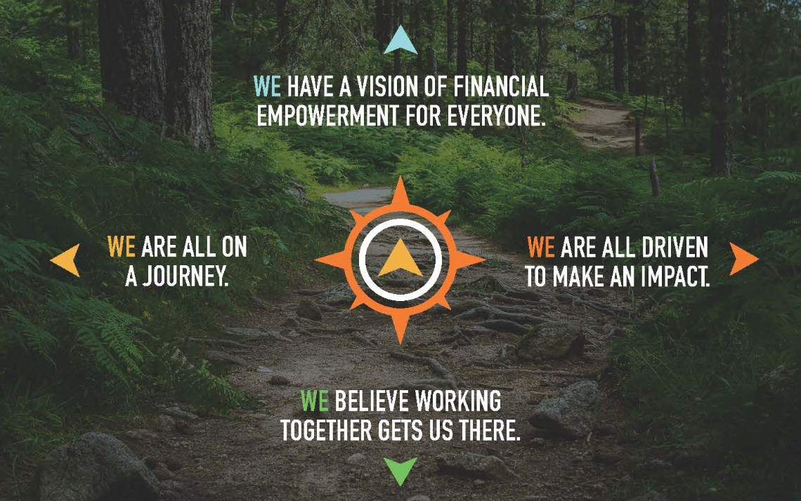
- Vintage modern logo design + new Explorers brand promise and compass design mark
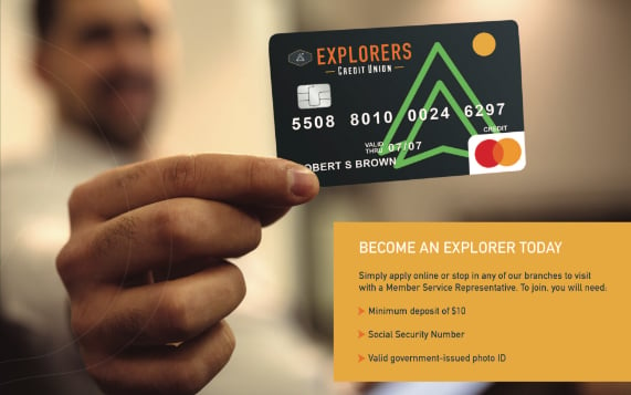
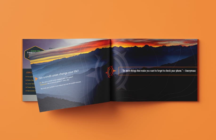
- Revised brand collateral, signage, credit/debit card designs, social media ads, outdoor billboards, local newspaper ads, website refresh and brand launch video


Overwhelmingly positive reaction for credit union members and staff.


